• Portfolio
  • Writing
  • About
  • Blog
  • Contact

Michele Tepper

  • Portfolio
  • Writing
  • About
  • Blog
  • Contact

Epic games

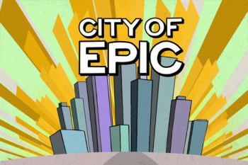
I didn’t find out about the City of Epic Kickstarter campaign until about half an hour before it closed, or I would have mentioned it sooner. But it’s worth talking about and keeping an eye on even if you aren’t a donor.

“Gamification” has been a buzzword in interaction design for a couple of years now, inspired by the success of Foursquare and similar systems that give you points and badges for achievements. There’s some evidence that adding game-style features to behavior modification systems works; Gretchen Anderson has done some great work on how to think about these features as you build your system. But, like with 3D movies and bacon-flavored everything, there’s been a backlash: too many people have slapped badges and points onto otherwise undistinguished apps and hoped those tricks would rescue the experience, so now people new greet points systems with some understandable skepticism.

What I like about Kelly Maguire and Katherine Ramos’s take on games is that they are approaching it from the other direction. Having gotten started by competitively checking in at the gym on Foursquare, they understand the value of points systems, and where their impact starts to wane. So they decided to try to start from the other direction - create a good game, and layer real-world achievements into it. I am not sure whether this will be a harder or easier thing to do, but it certainly distinguishes them from the pack.

I have some confidence that they’ll be able to pull it off from having met Kelly Maguire through a close mutual friend. Kelly’s best-known project is the Tinysaur, a set of teeny tiny laser-cut make-your-own-dinosaur kits. Making the Tinysaur required technical skill, a creative vision, and most of all a sense of the value of delight for its own sake. A tinysaur is just a ridiculous thing, but you can’t help smiling at those photos. Delight is too often undervalued and underconsidered as a design element; the fact that City of Epic is already delightful (watch that Kickstarter video!) makes me very happy indeed.

Kelly is also the co-creator of the Indie Crafts Shows directory site, now five years old, which means she knows something about building for, and sustaining, a community as well, which will be a critical piece of the puzzle. I don’t think that the game will stay thrilling forever - games, like stories, have an end. But Katherine is right when she notes on the company blog that motivation and consistency are key factors to starting a workout routine. Giving people a reason to build that consistency in the early weeks and months, before they start seeing results, is something City of Epic could be great at. What it will need as it grows is a way for people who have built that consistency, who have that routine, to want to stay engaged. A MMPORG designer once told me that most of their subscribers, after a certain plateau of success, are just there to hang out with their friends; Katherine and Kelly will have to watch to see what the City of Epic equivalent of that is, and figure out how to design for the person who is happy going to the gym twice a week but doesn’t necessarily want to do more.

The Kickstarter campaign is over, and successful, and Kelly and Katherine are off working on the beta. But I am sure if you were to contact them about adding a late donation, they would be interested in talking further.

tags: cityofepic, games, gamification, kickstarter
categories: Interaction design, Technology
Sunday 06.19.11
Posted by Michele Tepper
 

"We're going to demote the PC"

“Keeping [our] devices in sync is driving us crazy. We have a great solution for this problem. We are going to demote the PC to just be a device.”

- Steve Jobs, WWDC 2011 Keynote

Between iCloud and the Wii U announcement, it’s been a great week for multi-screen experiences. Large players in the industry are getting behind the idea that the system is more important than any given platform. I think this will lead in time to a proliferation of new smart devices, and a whole new range of exciting interaction design problems. 

What I find myself thinking about is some user research I did in 2007 on the future of mobile connectivity. The iPhone was brand new, 4G connectivity was starting to get built out, and we were being asked to think three to five years out, to what the right offering for our client would be as we looked towards a 2010-2013 timeframe.

One thing that we heard over and over again, from interviewees in a range of demographics, was that they wanted an uninterrupted experience across platforms. “Why should I have to learn a different screen layout on my phone than on my computer?” asked one guy.* “It should look the same, it should work the same.”

We put that point into our research and recommendations, and then more or less ignored it. At least for the short-term tools we were building for the client’s initial rollout, there was no way the UI could be the same on a smartphone as on a desktop. And after a long while struggling with the limitations of a mobile screen, we started to wonder - why would you even want that, anyhow?

What I realize this week, looking at iCloud and Wii U and the rest, is that that our interviewee might have been asking for the same UI, but what he really was looking for was the same experience. He wanted what he’s starting to get - the ability to access the same data, the same documents, the features and functionality from one platform to the next, and move seamlessly across them. John Gardner, in The Art of Fiction, says that the writer’s goal is to create “a vivid and continuous dream in the reader’s mind.” We are coming closer - and right on that 3 to 5 year out schedule, no less - to being able to create a vivid and continuous experience. I can’t wait to see where this goes.


* All quotations from memory, and guaranteed unreliable 

tags: apple, icloud, multiplatform, nintendo
categories: Interaction design, Technology
Friday 06.10.11
Posted by Michele Tepper
 

Belated friend-blogging

My New Year's resolution to post to my blog more often was quickly challenged by my ongoing battle royale with the office cold, which has been epic. Thus I didn't have a chance to post a timely link to Clive Thompson's terrific piece on the problems with computerized voting machines - luckily, now the NYT archive is free, and Clive handily posted the piece to his blog. It was a typically Clivean excellent piece - full of great details, good explanations, and terrific quotes. No one who works with computers could have failed to have a chill run up their spine reading this:
When a county buys touch-screen voting machines, its elections director becomes, as Warren Parish, a voting activist in Florida, told me, "the head of the largest I.T. department in their entire government, in charge of hundreds or thousands of new computer systems, without any training at all."
My one disappointment with the piece is that he didn't mention the other way people are working to ensure that votes are counted correctly -- through design. The Design for Democracy project of AIGA, which featured among other contributors the work of my friend and neighbor Mary Quandt, has created best practices for polling place and ballot design, from a visual and information design standpoint. Their work has been accepted as official guidelines by the federal Elections Assistance Committee, and AIGA continues to work with individual states (including, yes, Florida), to make their ballots and polling place instructions easier to read and understand. Reliable voting machines are important, but a butterfly ballot could still screw up even the most technologically perfect election.

Read more

categories: Interaction design, Technology
Wednesday 01.23.08
Posted by Michele Tepper
 

Weekend reading

For myself, I'll be continuing to read The Arsonists's Guide to Writers' Homes in New England, which is, fear not, a novel. But if you're looking for some Awesome Design reading, you could do worse than Five Reasons Why The iPhone Is Older Than You Think, which was written by my boss and makes reference to some findings from a research project I led. I also recently had my mind blown by The Sound of Interaction Design, which manages to combine principles for good design for interactive products with The Sound of Music. Goddamn clever British people. For those of you observing Yom Kippur, an easy fast, and a happy and a healthy New Year. Everyone else, have a great weekend, and eat something really fattening and greasy for me!

Read more

categories: Interaction design, Personal
Friday 09.21.07
Posted by Michele Tepper
Comments: 1
 

Awesomeness

Recently, I had to write a bio for a not-work project I'm doing. I'm doing interaction design for the project, but I'm doing it for free in my (hah!) spare time, and I don't want it to seem like my employers are involved or endorsing it. So I left out their name and what I've done for them, and I sent the draft to Shana, my PR go-to person. She made a couple of minor edits, and then said, "OK, you don't want to mention your job, but don't you want to talk about what you do?" I said, "I did! It's right there in the first sentence! 'Michele Tepper is a digital interaction designer and usability expert.'" She said, "Yeah. I don't really know what that means, and I've been listening to you talk about it for years." This is an interesting problem -- sure, good design is (usually) invisible, but if you don't know what sort of design it is that you need, how can know how to ask for it? No one but my sister goes to the legal site she told me about, where she consistently chooses the wrong button because of where it's placed, and thinks, "what this site needs is an interaction designer." Also, I think "interaction design" sounds too much like "dancing about architecture," to be honest. But what are the better options? My current job title, "design analyst," sounds like I have coffee makers in once a week to obsess about why they aren't better liked. "Information architecture" is a little ponderous and not, in this age of rich internet applications, fully descriptive of what I do anymore -- sorry, Lou. "User experience designer" sounds like marketing. My mom once bragged that I was her "interface guru," but as much as I loved that, I don't think it'll catch on.* So I was intrigued by Alex Ross (the critic, not the artist, you nerds) and his attempt last year to rebrand classical music as awesome music. How excellent is that? It's even finally gotten some traction, with this weekend's Awesome Music Live concert. Don't worry, newcomers! It's not boring, it's not incomprehensible: it's awesome! I think when talking to non-technical audiences, I'm going to try referring to what I do as "awesome design" -- it won't be any more misunderstood than anything else, and it might lead to some good and fruitful conversations. *And yes, I am aware of the irony of the group of people charged with making things easier to use and understand being unable to decide what to call themselves as a group, but I think that's actually a condition of having a large group of people who care deeply about the nuances of labeling: something like Gödel's incompleteness theorem, except without all that math.

Read more

categories: Interaction design
Sunday 09.09.07
Posted by Michele Tepper
Comments: 4
 
Newer / Older

Michele Tepper • User Experience Design & Strategy • Brooklyn, NY