• Portfolio
  • Writing
  • About
  • Blog
  • Contact

Michele Tepper

  • Portfolio
  • Writing
  • About
  • Blog
  • Contact

Computers and the "real" world

The world we live in today is made of computers. We don’t have cars anymore; we have computers we ride in. We don’t have airplanes anymore, we have flying Solaris boxes with a big bucketful of SCADA controllers; a 3D printer is not a device, it’s a peripheral, and it only works connected to a computer; a radio is no longer a crystal, it’s a general-purpose computer with a fast ADC and a fast DAC and some software.

- Cory Doctorow, The Coming War on General Computation

This is a fundamental change, and like most fundamental inflection points in the way we see the world, it will take most of us a while to catch up to it. But as interaction designers, it’s useful to be reminded of why our work matters, and why thinking of it as something that only happens in web browsers and traditional apps is so limiting. There are interactions everywhere; go make them better.

categories: Interaction design
Monday 01.16.12
Posted by Michele Tepper
 

What does a chatbot need to know?

I got a new iPhone 4S last week, and after having had my last iPhone (the 3G) since January 2009, I was blown away by how much faster the new phone is. Not to mention the value of voice activation - to be able to ask my phone “where am I?” and get an answer almost immediately feels nearly magical.

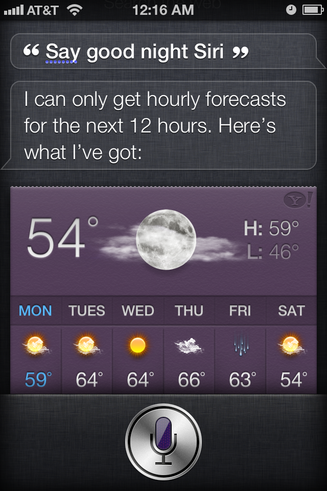
After seeing all of the various Siri Easter eggs people have been posting, I figured I’d come up with one that would be a softball. But Siri whiffed it: 

Well, I thought, maybe it’s my upbringing, with my Greatest Generation grandparents, that makes me think you’d want to teach Siri that the correct answer to “say goodnight, Siri” is “Goodnight, Siri.” And so I went about my day.

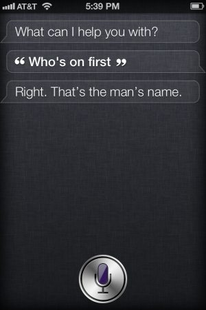
The next day, however, I tried again, and I succeeded:

Once I got past my delight that it worked, and the associated delight in hearing the line delivered in Siri’s flat mechanical voice, I started thinking about why the Abbott & Costello routine would have made it into the programmers’ basket of Easter eggs, and Burns & Allen’s closing “say goodnight, Gracie” bit would not have.

AIs, even a fake-AI like Siri, needs a certain amount of cultural savvy to interact with its users, and to project for us what we insist on calling a personality even when it’s not attached to a person. A smart journalist I know thinks that “software personality designer” will be a separate career path within the next decade; I tried convincing him that that was what interaction designers already do, bring personality to their products, but the more time I spend with Siri, the more I start to think that such specialization may actually be necessary, because there is so much to consider and know.

In Richard Powers’s novel Galatea 2.2, there comes a point when they have to teach the AI at the center of the book about all the things its human trainers know that aren’t captured in the literary works they’ve been teaching the AI to read. The catalogue of items goes on for dizzying pages, because, as Powers’s narrator remarks, “worldiness was massive.” It will be interesting to see how and in which ways Siri becomes more worldly, and how that changes the experience of using it.

Until then, though, if anyone from the Siri team reads this: next iteration, the appropriate response to “say goodnight, Siri,” is “Goodnight, Siri.” Thank you, and remember to tip your waitress. 

tags: apple, burns and allen, fake AI, richard powers, siri
categories: Culture, Interaction design
Tuesday 10.25.11
Posted by Michele Tepper
Comments: 3
 

Never trust a computer you can’t lift

Last night, in her reporting on Steve Jobs’s death, Rachel Maddow played a clip from the introduction of the very first Macintosh. If you’ve never seen it before (and I don’t think I had) it’s worth a watch:


At around 3:22, the voice synthesizer on the Mac reads this phrase:
I’d like to share with you a maxim I thought of the first time I met an IBM mainframe: NEVER TRUST A COMPUTER YOU CAN’T LIFT!

The crowd at the demo goes nuts at this, as they should - it’s a well-phrased snark at the then industry standard. But watching it now, with my iPhone, iPad, iPod, and MacBook all close at hand, it’s a promise of the future.

What “never trust a computer you can’t lift” really means is that your computer should fit into your life, not the other way around. The first Mac didn’t just have the infamous handle, it had a carrying case  so you could take it to class with you.  It had a graphical user interface and a mouse, so you didn’t have to spend years in school, or keep a cheat sheet of key commands on your desk, to get it to add 2+2. It made it easy to make things look good, because people appreciate beauty, and it had an engaging personality. One of my friends kept his Mac Classic alive and running well into the 90s; when another friend walked into his apartment and saw it, she ran up to it and gave it a hug. 

Steve Jobs didn’t come up with the idea of making the way people think and act the center of the computing experience. But just like he did with the mouse and the graphical user interface, he took an under-appreciated vision and he built the team that made it a standard. There would almost certainly still be a profession like interaction design if there had never been an Apple. But it would have fewer tools, fewer resources, fewer success stories, and it would almost certainly be a lot smaller. I owe Steve Jobs for frog design, and the six years I spent there, but I also owe him so many of my friends who never worked there at all. 

Particularly as someone who spends a lot of time designing for mobile UIs, I owe Steve Jobs a huge thanks. I love to tell the story of the way the frogNY studio reacted to the original iPhone keynote: there was honest-to-God jumping up and down and screaming. And that wasn’t because we were all giant Apple nerds, although we were - it was because we’d all worked on mobile projects that had gone nowhere. You’d come up with something innovative for a telco, but they couldn’t get the handset manufacturers on board, and vice-versa. None of the ideas behind the iPhone were things I hadn’t seen in concept pieces — what made it extraordinary was that it was finally real. Apple was one of the few companies that could have come in and broken the mobile industry’s logjam, and probably the only one of that handful that would do so thoughtfully and usably. Everything that has happened since to make our telephones into our mobile assistants, smart extensions of our homes and lives, comes in some way from that moment. No wonder people were jumping up and down. 

Last month I sat with my nephew at his first birthday party and showed him how to scroll through the pictures on my iPhone. He sat transfixed, watching pictures of himself and his sisters go back and forth on the screen. It must have seemed to him, like it still seems to me, like magic. Steve Jobs was no magician, but he gave the designers and engineers he hired a vision, a goal, and a standard to meet. All of us who make things for other people to use are in his debt, and we’ll continue to carry his computers — now even easier to lift.

tags: apple, steve jobs
categories: Interaction design, Product design
Thursday 10.06.11
Posted by Michele Tepper
 

Design Worth Doing

Jon Kolko would tell you himself that he’s a disruptor and an instigator. He likes to come into a conversation with an incendiary position and then fan the flames. When we worked together at frog, I once brought a knitting project to a talk he gave so I wouldn’t be tempted to live-tweet snark about it. I give him a lot of slack because his heart is usually in the right place, but his latest piece for Johnny Holland is way too problematic to let pass. Jon’s selling people on a model of interaction design as calling that’s not only wrong, it is, I think, potentially harmful both to the profession and to the people who we want to have enter it.

Talking about what he wants to inspire the designers who come through the Austin Center For Design (AC4D) to do, Jon writes:

If we recognize the power of design, and also recognize the finite length of our careers, we arrive at an interesting place – a place that demands we focus only on the most pressing, demanding, important, and critical work.

Consider that, in your career, you have about forty or fifty good, productive years to work.

 Should you really be focused on creating a new UI for a thermostat? A new façade for a banking website? A new operating system for a mobile phone? Or are there other things – things that are more financially, culturally, or spiritually more valuable – that you could, and should, be doing?

I’ll let other people talk about the value of mobile OSes, and the disruptive potential of mobile technology for the developing world. And I’ll only note in passing that as of today we have a United States Federal Consumer Financial Protection Bureau, dedicated to promoting “fairness and transparency for mortgages, credit cards, and other consumer financial products and services,” so clearly someone thinks that better interactions with your financial service providers are important to the nation’s well-being.  But because I’m the creative director at a startup developing systems to manage and monitor your home energy consumption, including new web and device interfaces to manage your thermostat, I will take a moment to talk about thermostat UIs - and I promise I’ll tie it in to a larger argument.

The best estimates are that about 10% of all energy use in the United States goes into heating, ventilation, and air conditioning (HVAC). The average American family’s share of that number is roughly half of their total energy use, at a cost of about a thousand dollars a year. To put that number into perspective, the median American family income in 2010 was about $50,000 before taxes. 

The EPA estimates that the average family could save $180 a year with a properly programmed thermostat, and programmable thermostats are now standard in new home construction. However, the EPA revoked the ENERGY STAR certification from all programmable thermostats in 2009 because they were too hard to use, citing “the potential for user interface issues to reduce energy savings.” Credible research suggests that 90% of current programmable thermostats aren’t being used as they were intended. 

Now let’s say you could build a thermostat UI that passes rigorous usability testing with flying colors, that educates people about energy-efficient choices, and makes it easy for them to program and manage their thermostats. A thermostat that could actually help people save money during a recession, and reduce consumption of the fossil fuels behind climate change. Is that “pressing, demanding, important, and critical work” yet?

I walked you through this not just because I like my job, but because I think the examples Jon chose show a basic flaw in his case for AC4D, which doesn’t even need him to make that particular case for it.

Jon is the Executive Director of Design Strategy at a “venture acceleration firm,” where he helps his clients make “substantial leaps in their equity value.” The work he highlights in his Johnny Holland piece from AC4D, the design program he founded, is all targeted at high-risk populations like the chronically homeless, longterm healthcare patients, and their caregivers. What he misses out on between these two poles is all the stuff in between: the ordinary needs of ordinary people. The family for whom $180 a year, year over year, is worth the investment in a new, easy to use programmable thermostat — and the thousands of tons of fossil fuels that can be saved when that choice gets made over and over again in households across America. 

Design that helps everyday people better understand and act on their environments in their day to day lives is important work, maybe the most important work. I’ve always argued that interaction design can have an ethical component, because it gives people greater control and agency over the technology that’s more and more central to their lives. Sometimes that’s not easy to remember, if you’re making something that helps a telco maximize the amount of data their customers will use, or creating upsell tools for advertising, but it’s part of - I think, the best of - what we can do.

But more than that: don’t listen to me, or to Jon, or to anyone else, who tries to tell you what you should or shouldn’t make as a designer.

No one gets to judge the reasons why you do the work you do. Maybe you need a guaranteed steady income to support your family. Maybe you need to be home every night at a predictable time, or you’re a devotee of the “medium chill.” Maybe you like making mobile phone operating systems, or HR tools, or POS terminals. Don’t let people make you feel like if you haven’t been out making applications to combat malaria in sub-Saharan Africa, your career is a waste. Believe me, there are plenty of people doing that kind of work who feel burnt out and ground down too.

If you’re staying where you are because you’re afraid, or because you don’t want to lose your sweet vacation package, or something like that, then yeah, maybe you need to take a good long hard look at yourself and what you’re doing. But if you can find pleasure in the work, and you’re adding to the store of good design in the world, then ignore all this useless advice and follow your own heart. Fight for user-centered design wherever you are. Make things that people like using, that can help them do the things they want or have to do. Do the work. Let the community judge you on that, not anything else. 


Many thanks to my colleagues Stephan von Muehlen and Sarah “no relation” Bieber for help with statistics.
tags: thermostats
categories: Interaction design
Thursday 07.21.11
Posted by Michele Tepper
 

Foursquare's ambidexterity

Foursquare just hit ten MILLION users. And they’ve just rolled out a new version of their iPhone app. Despite being a 4.3 rather than a 5.0 release, I think it’s a major step up in functionality.

First, it’s so much faster. Foursquare has become almost unusably slow; this release is not only faster on the backend, the interface feels faster, with the check-in button available from the top level of the interface, and better feedback when check-ins are being processed. 

Foursquare 4.3 for iPhone screenshot from the Foursquare blogSecond, my favorite part is where they chose to put that top-level check-in button: in the middle. Most mobile applications still put the default action at the far left of the screen: that’s where the Twitter iPhone app puts the “new tweet” button, for example. That works great for right-handed users, gripping their phones in their right hands: it’s perfectly positioned for that right-handed thumb. For a left-handed person like me, though, it’s literally a stretch: my thumb has to pull all the way back to the palm to tap. (That’s why I loved the Twitterific iPhone app: it had a left-handed option that reversed the order in which items appeared on the nav bar. When Twitterific dropped that feature, I dropped Twitterific.)

Foursquare’s solution is so obvious in retrospect, I am kicking myself for not having seen it. Put the default action in the center of the screen. You need to give it a little bit more visual priority so it’s easily understood and targeted, but this simple step makes it equally accessible to left-handed and right-handed users. It’s a great idea, and one I fully intend to build on in the next mobile app I make. 

(It’s also another great story about how building for the minority case makes for better design for everyone; the new Check In button makes it really clear what you’re there to do, even after that initial pop-up goes away.)

I’m guessing there’s a left-handed person on the Foursquare core team, and to that person I say, thank you, from the bottom of my thumb. 


tags: foursquare, handedness, mobile
categories: Interaction design
Wednesday 06.22.11
Posted by Michele Tepper
 
Newer / Older

Michele Tepper • User Experience Design & Strategy • Brooklyn, NY