• Portfolio
  • Writing
  • About
  • Blog
  • Contact

Michele Tepper

  • Portfolio
  • Writing
  • About
  • Blog
  • Contact

Looking like itself: Product design beyond the touchscreen

The last product I worked on at frog has been out for a couple of months now - the Virtuo jukebox for Touchtunes. Touchtunes was a fantastic client, with an insanely dedicated team, and I was sorry to leave mid-project. So I’m really happy to see how great the final version looks and to see it get good press.

There are two key things I learned on this project about jukeboxes, which you can see for yourself in any bar you walk into with an actively-used jukebox. One is that they are still social centers. People gather around them in groups, they choose songs together, and they spend time thinking about how their choices will improve, or ruin, other people’s experience in the bar itself. The other is that modern jukeboxes, freed of the need for racks of CDs, freed in fact from the need for any physical controls other than the cash and credit card acceptance slots, have become unremarkable-looking. I’ve walked past jukeboxes in bars, thinking they were ATMs. And if the customer doesn’t know that the jukebox is there, they aren’t going to play it.

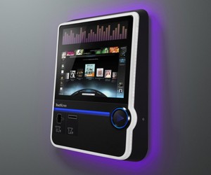
There are physical cues from old jukeboxes that newer jukes can use to tell you what they are: the columns of bright lighting up the sides, the domed top that feels like something out of Happy Days. Those cues get the point across, but they say “I’m like this other device you used to use” as much as “I’m a jukebox.” As a result, I think they have the side-effect of making the jukeboxes feel weirdly dated from the first day they’re on the market.

What I really love about the Virtuo is the way the physical form says “I am a jukebox” in a new way. And central to that is the big physical “Play” button. Even if the screen is running ads, or off entirely, you have no doubt what this device is for, because that play symbol is so universal. The cues are no longer the cues of the old jukebox, because the way we experience music has changed so radically. In incorporating a symbol that means “play music” today, the Virtuo marks itself as both a jukebox and as entirely up-to-date.

When the iPhone was new, I had a conversation with Luke Williams in which we wondered aloud about what would happen to industrial design in the brave new world of the touchscreen. What this project taught me is that sometimes, one button is all you need, as long as it’s the right one. 

(For more on the importance of buttons, and their changing role in interaction design, go check out the work of my friend Bill DeRouchey, and in particular his great presentation on the history of the button from SxSW.)


tags: Design research, buttons, industrial design, music
categories: Product design
Sunday 06.05.11
Posted by Michele Tepper
 

...And thereafter, they shape us

Yesterday, I went to a chiropractor for the first time. When she twisted her own spine to show me the ways in which I am out of alignment, I saw the way I sit when I write in longhand.  And I thought about Dr. Ralph Stanley.

Dr Ralph Stanley

The first time I saw Ralph Stanley and the Clinch Mountain Boys perform live was in New York City in, I think, 2000 or early 2001. And when he first came on stage, I couldn’t stop thinking about how off-kilter he looked. You can see it yourself in some photos, though they usually stage him so you can’t. His right shoulder is higher and broader than his left.

Then after the first song, he strapped on his banjo. And he was perfectly aligned.

Ralph Stanley aged around his instrument. He has played so long that his whole body has been reshaped to maximize its utility as a clawhammer banjo playing tool. It’s an extraordinary thing to see, and sort of an inspiring one.

It’s also, as my chiropractic appointment suggests, something of a cautionary tale. Now, I’m not going to compare myself to the great Ralph Stanley. But I do think of him as what I call, in my design research work, an “advanced outlier” - someone who shows us a behavior, or a solution, in its most extreme case.*

What Ralph Stanley reminds us is that physical products will have physical effects. Whether it’s exhaustion caused by non-ergonomic tools, or just the strengthening of some muscles rather than others, when we make things in the world, they become written on the body. We can’t always expect it - no one who makes a spiral-bound notebook expects that a kid is going to curl up around it as she writes, and keep writing that way long into adulthood. But in a product design practice, it’s always worth thinking about repetitive actions, repetitive stressors, and what can and can’t be mitigated as we go. Someone who plays the banjo as long and as much as Ralph Stanley has will be quite literally formed by the experience. What forms, in smaller ways, are you imposing on your product’s users? 


*Eric von Hippel has talked about “lead users” and “advanced analogues” in his fantastic Democratizing Innovation, which is a similar idea as well.

categories: Product design
Thursday 06.02.11
Posted by Michele Tepper
 

Yale School of Management case study on Project Masiluleke

The Yale School of Management has done an interactive case study on Project Masiluleke, the project I was working on in South Africa in 2008. It walks through all the missteps and changes of plans as well as the successes of the project, and it’s a more compelling read as a result.

I’m featured talking about design research - I am delighted to be associated with the headline “Design Starts With The User” on YouTube! And as I sort of get at in the interview, one of the great values of the trip ended up being the fairly massive case of culture shock I got from it.

The questions you ask about a place when you haven’t been there, and you impose your own rhythms and patterns and expectations on it, and the questions you ask when you have at least scratched the surface, those are different things. And I don’t pretend we were able to do anything more than scratch the surface in the ethnographic research I did in Kwa-Zulu Natal, but the depth of the local knowledge, and quantitative scientific expertise, of our partners at iTeach meant that all we needed was someone who knew enough to have a sense of where they were coming from.

tags: Design research
Wednesday 06.01.11
Posted by Michele Tepper
 

The face of good software design

Yes, it’s the inevitable “what Apple does right” post.

Because I’m some sort of Luddite, I only just recently upgraded my iPhoto library to take advantage of Faces. And when I did, I was really struck by the wait screen while it worked.


A lot of developers’ first instinct would be to have the faces that iPhoto was recognizing flip by quickly, emphasizing the power and speed of the application. Apple, on the other hand. holds on each recognized face for a surprisingly long time.

They realized that I don’t care about the app, I care about the people. A bunch of flickering images aren’t going to resonate with me. A reminder of when my nieces would stare at a camera like the flash was going to steal their baby souls, on the other hand, I can let run for quite a while.

Tuesday 03.08.11
Posted by Michele Tepper
 

The network-haunted world

When I first thought about restarting a blog, I saved something an old friend had posted to Twitter, complaining that his complex set of networked devices weren't working together perfectly. I'm glad I lost it, because it's hardly fair to single one person out for a wider tendency. The tendency, though, is still worth talking about.

The Internet, that plucky band of networked servers, works together pretty well, almost all of the time. Well, at least as far as the average user can tell: go ask your sysadmin. In our homes, though, we have all sorts of networking protocols in operation - I can see Bluetooth, 3G, GPS, wi-fi, and RF-enabled devices from where I'm sitting as I write this. These mostly work together well, thanks to a whole host of regulations that again, most of us never have to think about. But because we don't have to think about them, because we're so used to being able to click a button on our computers and watch live simul-translated video online, when these networks in our homes fail to work, people sometimes don't understand what's wrong. Why can't my router in my home office provide a reliable wi-fi signal to my bedroom? The four walls and part of another apartment between the two things might be part of the problem, no?*

Working making things that have all sorts of radios inside of them, dealing with physical constraints like "these radios have to be at least 20cm center-to-center apart from each other, or the thing won't work" has given me a new respect for the difficulty of making things talk to one another, and how difficult it is to work with a material you can neither see or touch.  That's part of the source of my admiration for the Immaterials: Light Painting Wi-Fi project that Matt Jones & Jack Schulze of BERG London pointed to in their talk at SVA last week, and also for the Dan Hill project that is, if not Immaterials' direct ancestor, then certainly its nerdy uncle. They do the hard work of making the workings of the world directly visible to us. They ask us to see the connections between the technological underpinnings of our networks and the ways in which we go about our everyday lives. They show us what we're swimming in, and where the edges of the ocean are. Not a bad place to start.

*That's my apartment. I'm fine now, thanks

Monday 03.07.11
Posted by Michele Tepper
Comments: 1
 
Newer / Older

Michele Tepper • User Experience Design & Strategy • Brooklyn, NY