• Portfolio
  • Writing
  • About
  • Blog
  • Contact

Michele Tepper

  • Portfolio
  • Writing
  • About
  • Blog
  • Contact

The New Foursquare and Me

I was a big fan of Foursquare’s last iPhone app - I wrote about it here. So when the new version was rolled out with lots of fanfare, I was excited to download it and try it out. But when I saw it, I was heartbroken.

The app is definitely more beautiful - a great example of how design can make even a small screen feel spacious and exploration-friendly. The look and feel is more polished, more sophisticated, and visually richer. So why didn’t I like it? 

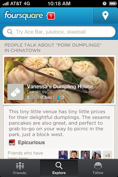
They moved the check-in button. 

It’s out of the “thumb zone” and up in the top-right corner, where typically you’d expect important secondary options. It’s also for me, as a left-handed person, one of the harder places on the screen to reach easily if I’m holding the phone in one hand. 

I didn’t understand why they would do something so apparently user-unfriendly until I read this New York Times article about the redesign. The key paragraph:

The company says its app’s basic check-in function has become less popular, with users more often just looking to see what their friends are doing, or searching for information about bars and restaurants. 

I’m an early Foursquare adopter - heck, I migrated over from Dodgeball. So of course to me the check-in button is the center of the experience - it’s what I’ve been using for years. But to service a new set of users, and build itself up as a recommendations tool, Foursquare has taken the Explore button and given it the center-bottom pride of place that check-in used to have. What I thought at first was Foursquare making a mistake with the central feature of their app was instead them redefining what the center of their app is going to be. 

It’s hard to see products you like and use change, and it’s scary from the other side to risk alienating your early adopters. I admire Foursquare’s willingness to look clearly at what all their users want from the app, and evolve to serve their new audiences, even if it leaves me as a longtime user a little sad to be left behind. 


Thursday 06.21.12
Posted by Michele Tepper
 

Failing at focus groups

Back in March, I was part of a focus group for an online shopping site. I’m not a big fan of focus groups - there are too many interpersonal dynamics at work and I think you get better, more authentic responses in an interview. But it was $100, and an opportunity to be on the other side of the table for a change, so I was legitimately psyched walking in to the session.

Unfortunately, it wasn’t the good experience I was hoping for. I’ve sat on my post about it for a while, unsure whether I wanted to say anything publicly, but I think it’s worth it if it helps anyone stumbling across this post run a better user research session in the future.

The first thing I noticed, after checking in at the door, was that there was no release or mutual NDA for me to sign. Then, they immediately wanted to take my picture. I said I wasn’t comfortable with that, and they didn’t pressure me, but the same photographer was snapping away throughout the two hour session, and I am sure there were plenty of photos of me in the mix.

I know that the NDA is an easy piece of paper to forget or handwave away as unnecessary; I’ve done it myself in the past. That was a mistake. Don’t ever skip the NDA, especially if you’re taking pictures or video. I was surprised to discover how much having my picture taken during the session threw me out of the experience and put me on my guard, all because I didn’t have confidence that my picture wouldn’t end up on some corporate promotional site somewhere.

(And for those of you who say “oh, we’d never do that; we’re really careful with our confidential research material!” let me tell you a story I heard from someone who worked in-house: one of her designers took all the pictures they’d taken during a usability session and proudly posted them to the corporate Flickr feed. Only being reminded of the mutual NDA that all the testing participants had signed got the designer to take them down. Now you can say, and rightfully so, that this story proves NDAs aren’t guarantees someone’s privacy will be respected. But at least they give the interviewee some confidence and some recourse if it isn’t. Don’t skip this step.)

The second thing I noticed were the set of cafe tables on the far side of the room, and the group of people who all seemed to know each other sitting there and chatting. Oh, that can’t be the clients, can it? I thought. Yes it can. The moderator, from a small SF-based brand research company, tried to explain that it was more “authentic” for the team from the online shopping site to be in the room with us, that you can’t really grasp all of the nuances of body language and the subtlety of interpersonal communication while eating M&Ms behind a one-way mirror.* If anyone ever tries to sell you, as a client, on this being the best way to do research, please show them the door, because they are talking nonsense. Don’t be in the room observing your focus group.
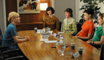
Photograph © AMCThere is a huge body of research that shows that people’s behavior, perceptions, and attitudes are changed by their environment, and part of their environment is the people who around them. Doing user research, one of your biggest challenges is getting people comfortable with an extremely artificial situation, one in which you are paying them for their opinions on something that the typically believe (rightly or wrongly) that you have some personal investment in, so that you can get past polite awkwardness and into something like truth. When you feel yourself being watched by the people who want your opinions, it’s going to change what you say, and make it more what you think they want to hear. 

What’s more, the rationale that the clients could see us better out from behind a one-way mirror was ridiculous on the face of it, because they were sitting behind the table, which meant they were staring at the back of two focus group members’ heads. Lots of ability to see the nuance of what was going on there, indeed.

I’ve spent some time trying to figure out what led the brand consultancy to use this weird setup, and I’ve only come up with two possible answers. One is that they had us get up and look at images pinned to the wall, and in a typical focus group room, that would have been harder. The other is that, since they were specifically targeting people who live in Brooklyn, they wanted to make sure the sessions were in Brooklyn, and they couldn’t find a proper research facility outside of Manhattan. These are both understandable concerns, but neither of them are insurmountable, and neither one is worth giving up whatever measure of critical distance that not having the people paying for the research in the room during the research can provide.

The final thing I noticed was the composition of the group. Out of the ten women at the table, two were in marketing, one worked in branding, and three (including one of the marketers and me) had experience running focus groups. I can almost make an argument that if you want Brooklyn tastemakers, you want to include a few people whose job involves branding and marketing, but even so, you need diversity, and more people who don’t know how the sausage is made. Screen your focus group members effectively.

Portigal Consulting, one of the top user research consultancies on the West Coast, talks about the complexity of writing a good screener on their blog, with links to a sample screener. If you go to that screener (which is a great example of a script for a recruitment firm), you’ll see that a lot of the early questions are looking for, and getting rid of, people just like the ones who were around that table. Why? Because most people don’t work in marketing and user research, and don’t think like them. Just like I wouldn’t want to just take a programmer’s word on what makes for a great piece of consumer software, I wouldn’t take a marketer’s word - or my own word! - on what makes a compelling online shopping experience. We’re not the typical user, and we think about it differently than the typical user would. It’s precisely to get that perspective from the other side of the interaction that you do user research and focus groups in the first place. 

I went home that night annoyed in the way that only a job badly done can annoy you, and wrote an angry bunch of notes for this post. Then I unsubscribed from the site’s mailing list. I spent the honorarium on framing art that I bought somewhere else.


* The only downsides I have ever found to being in an observation room in a testing facility are (a) overdosing on M&Ms and (b) since Mad Men started, people who are new to user research come in and say “I feel just like Don Draper!”  
tags: Design research, focus groups, what not to do
categories: Product design, Technology
Tuesday 05.15.12
Posted by Michele Tepper
 

Same same, but different

Ze Frank is using Kickstarter to bring back The Show, his brilliant video podcast. Except this time, he’s calling it A Show, because of course it’s a different thing.


One of the many things I loved about the original Show was that it was the first video podcast I’d seen that felt really made for the extreme constraints of the video iPod.

Often, episodes would have Frank almost entirely in tight closeup, filling the frame, as if he were inside your iPod, talking to you. When there were cuts, they were just cuts in place, with no change to the angle of the shot. Sometimes, there would be a smash cut, in the same way that 30 Rock uses a smash cut to another scene to set up a punchline - but it would just be to Frank, doing something different, or making a funny face.

At the time, most of the video I watched on my iPod was either made for a larger screen originally (like 30 Rock), created by people who were used to framing shots for a larger screen (leaving me watching very little people talking), or created by people who didn’t know much about film and TV editing at all (leaving me watching a static medium closeup shot of someone just talking). This meant the video felt either far away or deeply dull. The Show was (almost) never dull, and it was very up-close and personal.

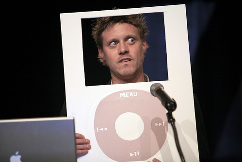
While I’m not going to downplay Frank’s skills as an entertainer, master of ceremonies, and duck wrangler, I think part of the reason The Show garnered such a large and enthusiastic fan base was that it used the constraints of the small screen as an advantage, to build a relationship with an audience. It used those constraints and those tight closeup shots to make something that felt so directly addressed to you, it was easy to relate to and connect to - and from there connect to the larger community Frank worked hard to build around it. It used those constraints so well that Frank appeared at the SxSW Interactive Awards in an iPod costume, joking that no one would recognize him outside that frame:

Ze Frank @ SXSW Interactive Web Awards by kk+, on Flickr

Frank ended The Show a year after it began, back in 2007. A lot has changed since then, including the devices on which we’re likely to watch a video podcast. I’m backing A Show on Kickstarter because I really liked the original, but I’ll admit I’m also curious to see how or if the way Frank does the show evolves to meet the challenges of the wider range of screens it’ll be watched on in 2012.

Wednesday 02.29.12
Posted by Michele Tepper
 

Travel and Banking

After getting my credit card frozen for the suspicious act of buying an airplane ticket to Ireland from an Irish airline, I made a point today of alerting the banks whose cards I intend to use on my trip that I would be using the cards outside of the country. Thirty minutes later, I’m left wondering why banks make it hard or unpleasant to help them do their jobs. 

Only thirty percent of American citizens have passports, and the size of the US means you can get pretty far from home and stil be buying in dollars. But I’d assume that there’s a high correlation between active travel outside the US and the sort of high net-worth customers the banks want, so it’s a little boggling to me that to tell my primary bank I might be using my ATM card overseas took twenty minutes on the phone. My secondary credit card bank was a lot better - there’s a separate interactive voice response menu option, or a form to fill out on the web. But in both cases the options are pretty buried deep in secondary menus, and the interactions weren’t what I’d call friendly.

Here’s an idea for my friends at Simple, or any other banking service that wants to give it a shot: surface travel notification tools in my account if I’ve ever used your services from outside of North America. Make the page where I give you my travel information friendly and good-looking. And once I give you that information, send me a confirmation email with additional information on how to avoid identity theft and fraud on the road.  

Thinking of every touchpoint where your customer might encounter your service, and thinking of how to optimize it, is a big and long-term project. But it’s these little moments - when you can make the chores of travel planning in the modern age into something pleasant, hassle-free, and useful - where you build customer relationships that will last. 

As you might guess from the above, I’m off to Interaction ‘12 in Dublin - if you’ll be there too, .

Monday 01.30.12
Posted by Michele Tepper
 

A Death in the Community

Scott Herhold probably thought he had a great human-interest story. The sad tale of a San Jose man named Phil Gustafson who’d slowly retreated from the world, cut himself off from ties to people and the basics of everyday living, and died alone, unmissed and unmourned - well, it’s got pathos in bucketloads, the sort of story designed to make you stop for a moment over your morning coffee and appreciate the people in your life. Who could resist? 

Except there’s a problem; the story isn’t so simple. In the networked world - a world first built by Phil and his generation of geeks - you can’t always tell who is alone, or even what being alone really means, quite so easily.

I first met Phil in 1994, over the Internet, in the hazy distant days when (to quote another member of that circle of friends) meeting people over the Internet wasn’t creepy, it was just weird. Before the Web, when geeks and nerds congregated on Usenet, we hung out together in alt.folklore.urban, a Usenet newsgroup dedicated to tracking and debunking urban legends. A lot of what Scott Herhold found out about Phil in his online search for who he’d been traces back to that community, right down to the quip in quotation marks in the sign-off, a subcultural marker the group regulars all used (here are some examples from my own posts).

Usenet stopped being much other than spam and piracy a long time ago, but friendships are different: the alt.folklore.urban folks aren’t the only group of friends who still stay in touch. Phil and I attended weddings and funerals together, we’d both attended group get-togethers all over the country, and while we weren’t close friends, we had the familiarity only a long-shared community can provide. I hadn’t seen him in years, but I still tell stories in which he gets the last line. He had his demons, but he was fundamentally a good person, and I’m not the only person who felt the news of his passing like a kick in the chest.

Herhold’s article was published on the afternoon of January 18th. I don’t know when the first of Phil’s friends spotted it, but by the 19th, when I heard about it, there were comments on it from our mutual friends all over the world, testifying that Phil would not be either unmissed or unmourned. Herhold’s article noted that the coroner’s office was awaiting official identification; the alt.folklore.urban old-timers’ mailing lists pulled out every reference they could find to Phil’s brother and sister in the email archives, tracked them both down, and took on the awful task of informing the family, so at least they’d hear it from someone who cared about him.

To me, perhaps the most remarkable part of this story is that it’s totally unremarkable, and yet probably surprising at the same time. Online communities do remarkable things every day, from raising money for charity to fighting laws that threaten their existence to stopping someone from getting caught up in a sex trafficking ring. But we still don’t necessarily think or know how to look for someone’s online affiliations and community memberships. 

Phil doesn’t fit our stereotype of the always-on “digital native”: he was a shy senior citizen. Herhold did go online to learn more about him, but Phil’s primary digital haunts - mailing lists and online poker games - are out of Google’s grasp. It’s true that for all of his online friends, Phil was only found because the mail and papers piled up outside his door - especially over the holiday season, when many people are offline visiting family and friends, his online silence wasn’t particularly notable. As the first generation of computer nerds who found their friends online age into their 60s and 70s, maybe we need a better system to let distant communities know when something is wrong. For now, though, I hope the outpouring has comforted his family, and maybe taught a columnist something about assuming too much in a human-interest piece. 

One of our friends, writing from New Zealand, commented on the article, which dwelled on Phil’s isolation from his neighbors:

phil was an early adopter of e-mail, usenet and other forms of on-line socialisation and he was a very social person on-line. he died with his computer on. why is there an assumption he was alone? most likely he had been socialising with someone just before falling asleep for the last time. is that not the most we can ask for? he lived in an age which allowed him to find a peer group of like minded people which spans the globe and travelled great distances to meet those people in person. i would say his horseshoe worked for him. he will be missed by many.


UPDATE: Please read the comment on this post by Carl, Phil’s brother, who deserves to get the last word.

tags: afu, online community, phil gustafson, usenet
categories: Life online, Personal
Friday 01.20.12
Posted by Michele Tepper
Comments: 2
 
Newer / Older

Michele Tepper • User Experience Design & Strategy • Brooklyn, NY